Dankfield: A Bold Display Font for Digital Brand Impact
Two weeks ago, I was finalizing the hero section of a new landing page for a boutique design studio—clean layout, muted palette, strong visual rhythm—and something felt off. The headline lacked presence. Not just size or spacing, but attitude. So I swapped in Dankfield.
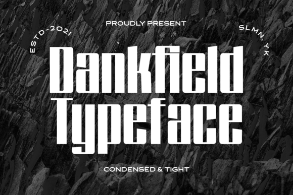
Instantly, the tone shifted. Dankfield isn’t subtle. It’s a thick, tightly spaced, techno-inspired display font with sharp terminals, geometric weight distribution, and that unmistakable “future-ready” confidence. Think industrial signage meets digital interface—bold enough to command attention, but precise enough to feel intentional, not chaotic. It’s the kind of typeface you reach for when your brand needs to say, “We’re here, we mean business, and we’re built for what’s next.”
In that hero section, Dankfield sat over a subtle gradient background—not an image overlay, but a soft, layered color field. At 48px on desktop and 36px on mobile (with proper viewport scaling), it held its shape beautifully. No blurring, no hint of pixelation—even at smaller breakpoints. That’s crucial: many display fonts break down on mobile, but Dankfield’s letterforms are engineered for clarity at scale. Its uppercase-heavy character set works best for short, high-impact phrases: “Launch Mode,” “New Collection,” “Build With Purpose.” Not for paragraphs. Not for navigation menus. But absolutely for moments where hierarchy needs to land in under two seconds.
I tested it across contexts. On a course sales page, it anchored the main value proposition above the fold—“Master Visual Systems”—while body copy used Inter, a neutral, highly legible sans serif. The contrast worked: Dankfield delivered authority and energy; Inter delivered trust and flow. On a portfolio homepage, I used it only for the site title and one subheading (“Work • Process • Vision”). Anything more would’ve overwhelmed the delicate photography and whitespace. Less is more—but *less* only works when the “more” you keep is this deliberate.
Readability? Straightforward—but with caveats. Dankfield shines on light backgrounds and clean dark modes. Over busy imagery, it needs generous padding or a subtle text shadow (2px black at 30% opacity). On buttons, it’s best reserved for primary CTAs in larger sizes (e.g., “Get Early Access”)—not secondary actions or microcopy. And never use it below 24px in UI components. It’s not a functional font; it’s a statement font. That distinction matters for UX consistency.
Pairing is where Dankfield really earns its place in a web designer’s toolkit. Its personality demands balance. I default to pairing it with a humanist sans like Poppins or a crisp neo-grotesque like Manrope for body, captions, and interface labels. For editorial-leaning projects—a creative blog redesign or a newsletter brand kit—I’ve paired it with a warm serif like Literata or Cormorant Garamond. The juxtaposition creates depth: Dankfield sets the mood; the companion font builds the conversation.
It’s also worth noting what Dankfield *doesn’t* do—and why that’s a strength. It doesn’t offer dozens of weights or optical sizes. It ships with one robust weight (Bold) and standard Latin character support—no extended Cyrillic or Arabic variants. That makes it fast-loading, lightweight for webfont delivery, and predictable in rendering. If your project requires multilingual support or fine-grained typographic control, Dankfield isn’t the workhorse—but it’s rarely meant to be. It’s the spotlight, not the stagehand.
I’ve used it on product landing pages where the tech angle needed reinforcing (“Cloud Native Tools”), on coaching websites where clients seek transformation (“Reset Your Framework”), and even on limited-run digital brand kits for indie creators who want their assets to feel both grounded and forward-looking. In each case, the font didn’t just “look cool”—it helped align visual tone with messaging intent. That alignment is where real brand polish begins.
Licensing is straightforward: it’s a commercial font, fully cleared for web use, desktop apps, and digital templates. The webfont package includes WOFF2 (optimized), WOFF, and EOT fallbacks—so it integrates cleanly into modern build pipelines. No surprises around usage rights or embedding restrictions. Just drop it in, declare it in CSS, and test across Safari, Chrome, and Firefox. It rendered consistently everywhere I checked—including iOS Safari on older devices.
One thing I appreciated during testing: Dankfield doesn’t try to be everything. It knows its role. That’s rare—and valuable—in a landscape full of “versatile” fonts that end up feeling generic. When you need a display font that says something unmistakable without shouting, Dankfield delivers with precision. It’s not for every headline. But when it’s right, it’s unmistakably right.
If you’re choosing a display font for your next web project, ask yourself: Does this moment need warmth? Playfulness? Tradition? Or does it need presence, structure, and a quiet kind of power? If it’s the latter, Dankfield belongs in your test stack. Not as decoration—but as deliberate, functional typography that supports how users perceive your brand before they even read a word.
- Best for: Hero titles, section headers, CTA banners, logo lockups (short names), campaign graphics, digital ads
- Avoid for: Body copy, navigation labels, form fields, small mobile buttons, long quotes
- Pair with: A highly legible sans serif (e.g., Inter, Manrope) or a refined serif (e.g., Literata, PT Serif)
- Check before deploying: Webfont format support, licensing scope, fallback behavior, mobile sizing, contrast against background