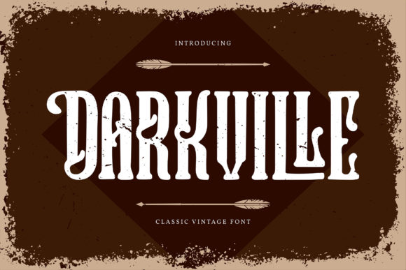
Darkville: A Bold, Moody Display Font That Demands Attention
First Glance: Gritty, Confident, Unapologetically Atmospheric
Opening Darkville feels like stepping into a dimly lit studio at midnight—rich with texture, intention, and quiet intensity. It’s not playful. It’s not neutral. It’s a display font that leans into contrast, weight, and subtle irregularity: thick strokes taper into sharp, slightly asymmetrical terminals; lowercase ‘a’, ‘g’, and ‘e’ carry quiet idiosyncrasies; capitals sit tall and grounded, with a slight forward lean that suggests motion without chaos. This isn’t a font for background noise—it’s for moments that need gravity, distinction, or emotional resonance. Think indie book covers, boutique perfume labels, limited-run apparel drops, or editorial features on urban culture or craft distilling.
Where Darkville Earns Its Place in Real Projects
In logo design, Darkville works best when the brand voice is mature, tactile, or quietly rebellious—think ceramics studios, vinyl record labels, or small-batch coffee roasters. It’s strong enough to anchor a monogram or wordmark, but only if paired thoughtfully (more on that below). For packaging design, it shines on matte-black boxes, kraft paper sleeves, or foil-stamped lids—its weight holds up under tactile finishes and ambient lighting. On product labels, use it for the brand name or flavor title, never ingredients or compliance text.
Posters and flyers benefit from its cinematic presence—especially when layered over grainy photography or muted gradients. Invitations gain instant sophistication with Darkville as the headline, followed by a restrained serif for body copy. Merchandise? Yes—but prioritize chest logos or back prints over small taglines. For website headers, it performs well above the fold on desktop, though test carefully on mobile: its dense letterforms compress quickly at smaller sizes.
Blog graphics and social media posts get an immediate mood lift—Darkville in a quote overlay on an Instagram story adds gravitas without pretension. In editorial design, reserve it for section headers or pull quotes—not body text. Digital ads gain memorability when Darkville anchors a bold CTA (“Launch”, “Reserve”, “Unbox”)—but avoid full sentences. As a printable design or Canva template element, it elevates premium offerings: wedding suites, artisanal workshop handouts, or digital product covers. And for Cricut projects? Its clean outlines cut cleanly, and its character set includes stylistic alternates ideal for custom signage or wall art.
Use With Precision—Not Generosity
Darkville is not a workhorse. It’s a spotlight. Reserve it for large headlines, short phrases (3–5 words max), brand marks, evocative quotes, decorative accents, premium packaging fronts, and high-impact social posts. Avoid using it for supporting text, navigation menus, long captions, or anything requiring fast scanning. Its personality is too strong to fade into the background—and too distinct to blend.
What It Does to Your Design System
Readability? Excellent at 36pt+, compromised below 24pt—especially in lowercase or tight tracking. Hierarchy becomes intuitive: Darkville commands attention, so everything else must recede gracefully. Brand consistency strengthens when used predictably—same weight, same case treatment (all-caps often reads cleaner than mixed case), same spacing rhythm. Audience trust builds not from familiarity, but from perceived craftsmanship: Darkville signals that someone *chose* this—not defaulted. Recognition rises because it stands apart in crowded feeds and shelves. Professionalism comes from restraint: using it where it belongs, not everywhere it fits.
Visual mood shifts decisively—toward moody, grounded, artisanal, or cinematic. Engagement lifts when paired with intentional whitespace and complementary textures (linen, concrete, brushed metal). But overuse dilutes impact fast. One Darkville headline per layout is usually enough.
Designer Notes You’ll Actually Use
- Test Darkville in pure black on pure white—and then reverse it. Its stroke contrast changes dramatically in negative space.
- Check small-size readability early: set your intended subheading size on a real device, not just in-browser zoom.
- Drop it into real mockups—not just type specimens. See how it sits beside product photography, fabric swatches, or screen UI elements.
- Compare uppercase vs. lowercase rendering side-by-side. Uppercase often delivers stronger brand presence; lowercase adds nuance but sacrifices immediacy.
- Review default spacing. Darkville’s built-in kerning is solid, but tighten tracking slightly for headlines, loosen for standalone words.
- Pair it deliberately: try it beside a warm serif (like Playfair Display) for editorial balance, a clean sans serif (like Inter or Manrope) for modern contrast, a delicate script font for luxury tension, or a rough-hewn handwritten font for craft authenticity. Avoid pairing with other heavy display fonts—they’ll compete, not converse.
- Confirm commercial licensing before any client or business use. Darkville is a premium font—you’ll need the proper license for web embedding, app integration, or resale of design assets containing it.
Final Thought: A Tool, Not a Trend
Darkville won’t solve weak concepting or poor layout—but in the hands of a thoughtful designer, it deepens intention. It’s not for every brand, but for the right one, it becomes inseparable from identity. It’s the kind of display font that makes people pause mid-scroll, tilt their head, and remember the name—not because it’s loud, but because it feels *meant*. Use it where mood matters more than metrics, where craft outweighs convenience, and where your audience values substance over speed. That’s where Darkville doesn’t just sit on the page—it settles in.