Galactica Grid: A Playful Display Font That Lifts Digital Branding
Last week, I was finalizing the hero section of a new landing page for a children’s creative learning platform — think interactive storytelling kits and illustrated activity bundles. The client wanted something joyful but not childish, bold but not overwhelming, and instantly recognizable at a glance. I opened my font library, scrolled past the usual suspects, and landed on Galactica Grid. Within five minutes of testing it in Figma, I knew it was the right fit.
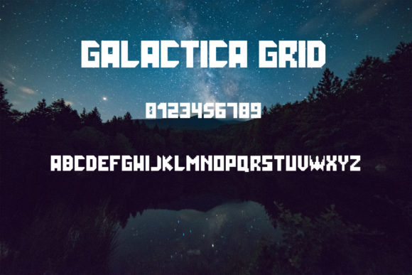
Galactica Grid is a display font — not meant for paragraphs or navigation menus, but designed to command attention. Its letterforms are geometric yet full of personality: chunky rounded terminals, subtle star-like corners, and confident spacing that gives every word room to breathe. It feels like a friendly cartoon character walked into your CSS file — playful, optimistic, and unmistakably modern. There’s no forced whimsy here; just clean, intentional design energy.
I dropped Galactica Grid into the main headline: “Build Stories. Spark Imagination.” At 48px on desktop and scaled responsively down to 32px on mobile, it held up beautifully — no visual crowding, no awkward kerning traps. On light backgrounds, it popped with cheerful clarity. Over a soft gradient overlay (a common pattern for hero banners), it remained legible without needing heavy text shadows or outlines. That’s rare for a display font — many lose readability fast when placed over imagery or in constrained spaces.
Where Galactica Grid shines most is in short, high-impact contexts: hero titles, section headers (“Our Approach”, “What’s Inside”), CTA buttons (“Start Exploring”, “Grab Your Kit”), and branded graphics for social media previews. I used it for the headline on a product card banner and paired it with a neutral sans serif (Inter, set at 16px) for the supporting description. The contrast worked instantly — Galactica Grid brought the voice, Inter brought the clarity. No competing personalities, just smart hierarchy.
It’s not ideal for long-form reading or small interface labels. I tested it at 14px for a secondary button label — too much visual weight, too little scannability. But at 20–24px for a primary action? Perfect. It adds just enough character to feel intentional without sacrificing usability. And because it’s built with digital interfaces in mind, the letter spacing is generous by default — no manual tracking tweaks needed for most web use cases.
For responsive layouts, I made two quick checks: first, how it rendered on an iPhone SE (small screen, narrow viewport), and second, how it behaved in Safari vs. Chrome. Galactica Grid loaded cleanly as a WOFF2 webfont, and the fallback stack I defined (system-ui, -apple-system, sans-serif) ensured graceful degradation if the font failed to load. No flash of invisible text, no layout shift — just smooth, predictable behavior.
Font pairing is where Galactica Grid really earns its place in a thoughtful design system. I’ve paired it successfully with:
- A clean sans serif (like Inter, Manrope, or even system fonts) for body copy, forms, and navigation — creates balance between fun and function;
- A gentle serif (such as Cormorant Garamond or Literata) for blog headers or editorial sections — adds warmth and narrative depth without clashing;
- Minimalist monospace for code snippets or feature highlights — creates delightful contrast in tech-adjacent creative projects.
Before deploying Galactica Grid in production, I double-checked three practical things: licensing, formats, and language support. It’s a commercial font with a clear web license — essential for client work or SaaS dashboards where fonts appear across domains and user sessions. The package included WOFF2, WOFF, and OTF files, plus basic Latin character coverage (enough for English, Spanish, French, German, and Dutch). No extended Cyrillic or Arabic glyphs — so I’d skip it for multilingual sites outside Western Europe unless supplemental fonts were added.
One detail that stood out during testing: Galactica Grid includes stylistic alternates — like a dotted “i” or a custom ampersand — that add polish to logo lockups or branded banners. I used the alternate “&” in a tagline (“Play & Learn”) and it elevated the whole micro-interaction. Small touch, big impression.
In real-world use, Galactica Grid works especially well for:
- Creative portfolios wanting to signal originality without sacrificing professionalism;
- Boutique online stores selling illustration-based goods, toys, or stationery;
- Coaching or education sites targeting curious adults and young learners;
- Landing pages for digital courses with hands-on, visual learning components;
- Brand kits where consistency matters — it holds up equally well in Figma, Webflow, and Shopify theme editors.
Readability on dark mode was solid — no halo effect, no contrast issues — as long as background luminance stayed above 15%. I avoided placing it directly over busy image textures, but with a subtle semi-transparent overlay (10–15% black at 70% opacity), it remained crisp and inviting.
What makes Galactica Grid more than just another decorative typeface is how thoughtfully it bridges expression and experience. It doesn’t ask users to decode its intent — it communicates joy, openness, and creativity immediately, then steps back to let the content do the rest. That’s the hallmark of good display typography: presence without pressure, personality without pretense.
If you’re choosing a font to represent a brand’s spirit — not just its name — Galactica Grid invites users in before they’ve read a single sentence. And in digital design, where first impressions happen in under two seconds, that kind of quiet confidence is worth every byte.